July 1, 2026 - Kristen Gudman
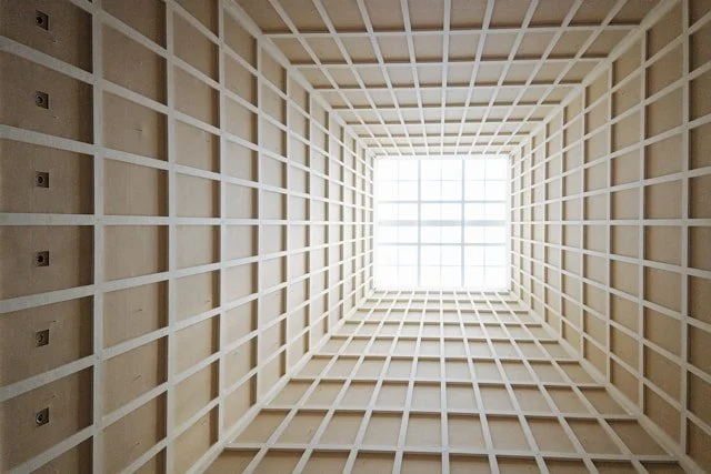
Open any magazine on a coffee table, scroll through a heavily formatted news app, or examine the layout of a classic textbook. To the untrained eye, the placement of the text blocks, the cropping of the images, and the spacing of the headers feel entirely natural, as if the elements simply fell into their rightful places on the canvas. But beneath this polished surface lies a strict, mathematically calculated infrastructure that has governed the visual world for nearly a century. This is the grid system. It is an invisible network of intersecting vertical and horizontal coordinates that serves as the architectural blueprint for typography and layout. Far from a rigid constraint, the grid is the ultimate mechanism for transforming raw information into structured visual communication.
To understand the necessity of the grid, one must consider the cognitive mechanics of how humans consume information. The human brain is a pattern-seeking engine; when presented with a page or a screen, it immediately attempts to map the landscape to determine a path of least resistance for reading. In the absence of a structural framework, where margins vary wildly, text alignments shift arbitrarily, and spatial intervals are inconsistent, the eye suffers from visual fatigue. The cognitive load increases because the viewer must constantly decipher the spatial rules of the page. The grid system mitigates this friction by establishing an absolute rhythm. By anchoring text, imagery, and negative space to a shared geometric foundation, it creates an intuitive hierarchy that allows the viewer to absorb complex narratives effortlessly.
Designing a functional grid is an exercise that balances mathematical calculation with editorial strategy. A graphic designer does not merely overlay a generic pattern across a canvas; they engineer the matrix based entirely on the specific demands of the content. A standard layout might rely on a foundational twelve-column system, which offers highly versatile mathematical divisions—allowing a designer to split a page into halves, thirds, quarters, or sixths depending on the density of the information. Between these columns sit "gutters", the precise defensive buffers of white space that prevent text columns from bleeding into one another. The horizontal markers, or "flowlines," dictate the consistent starting points for images and typography across multiple pages. This structural discipline removes arbitrary guesswork, turning the canvas into a controlled laboratory of spatial relationships.
The historical lineage of this technique traces back directly to the mid-20th century, championed by Swiss design pioneers like Josef Müller-Brockmann and Wim Crouwel under the banner of the International Typographic Style. Following the chaos of World War II, these designers sought an objective, universal visual language that transcended national borders and artistic whimsy. They argued that the designer’s ego should be subordinate to the clarity of the message. The grid became the ultimate tool for this philosophical shift, offering an egalitarian structure where content was organized with scientific clarity, emotional neutrality, and democratic accessibility. This methodology remains the direct ancestor of modern user interface (UI) and responsive web design, where digital grids must dynamically scale across phone screens, tablets, and desktop monitors.
The true mastery of the grid system, however, lies in the paradox of its flexibility. A common misconception is that a strict geometric framework produces robotic, uninspired, and identical layouts. In reality, the grid acts as a launchpad rather than a prison. Once a baseline of perfect order is established throughout a document, the act of deliberately violating that order becomes a powerful narrative tool. A headline that expands to break completely out of its designated columns, or an evocative photograph that spills over the established margins of the page, instantly commands the viewer's attention. This visual disruption only carries weight because the surrounding environment is so meticulously controlled. You cannot create meaningful tension on a page until you have a rock-solid foundation to push against.